(source)
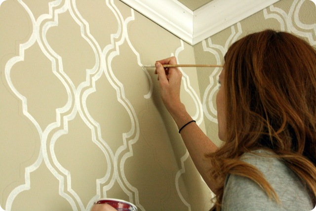
I knew I had to do it somewhere in the house. Around the same time, I decided that our half bathroom was entirely too boring and needed some sort of update on the wall. So, I printed out the template for the "DIY painted wallpaper," traced it onto some cardboard (an empty cereal box, actually), and got to work.
Here's the stencil!
I traced the stencil onto one wall in the bathroom, and stepped back to admire it...
Something about it just didn't thrill me. So I lived with it for a couple days, and in the end I decided I just didn't like it. The half bathroom is pretty small, and it just seemed like a busy pattern on the walls would make it seem smaller.
Plus, I seriously love the antique mirror that we put in there, and once I had the tracing done and could picture the white-on-tan stencil, it just seemed like it wasn't going to go with the classy, wood, vintageish vibe that the mirror had going on.
{Sidenote: I've recently started to hate that light fixture. In fact... I think I kind of hate all the light fixtures in our house except the dining room chandy, the new one in the piano room, and the fans. This has the potential to be an expensive sort of hate... let's just ignore the ugly light for now, okay?}
So I decided not to proceed with the stencil project. Sorry guys! I still love the idea, so I may try to do it later in another room (maybe the craft room, with an enlarged version of the template?), but as for the half bath... it's gonna get just a nice solid coat of paint.
We're leaning toward green....
I have a few friends who were SO disappointed that I didn't go through with the stencil project, so I fully expect to get some comments with the same sort of reaction. Don't worry... I haven't scrapped the idea entirely, I just couldn't bring myself to do it in this room!
I'll keep you updated, as always. :o)


Have you thought about trying to have the stencil on only some of the walls, then it wouldn't be too overwhelming and it wouldn't compete with the mirror. Like do the two side walls, but not the mirror wall and the opposite one. I think the large stencil would look great. Especially with the green. Maybe do a lighter gree in the same family. Just a thought.
ReplyDeleteI'm one of those people :)
ReplyDeleteLove the idea, so I do hope you try it out somewhere else!!
don't feel bad! it's your house, so it should be a reflection of what you (and jeff, ha ha) love!
ReplyDelete